
Master Multi-Units - Logo and literature
Categories: Logos and Branding
Fusional was fortunate to be considered to create the new corporate identity for MMU. Favoured colours of blue and orange were discussed along with clean modern typography.
The early designs developed into a modern identity with symmetrical cubes suggesting the key stages of the Learning and development service that MMU offer to their core market. 4 main logo variations were requested to highlight the main areas of MMU: Leading, Developing, Inspiring and Educating.
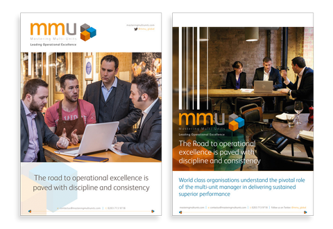
The project also involved a 20 paged brochure with sub icons to endorse the key areas to enhance an organisations performance along with website graphics, charts and general marketing material.
Get in Touch
Fill the form below and we will get back to you as soon as possible.